Web Remote Updates
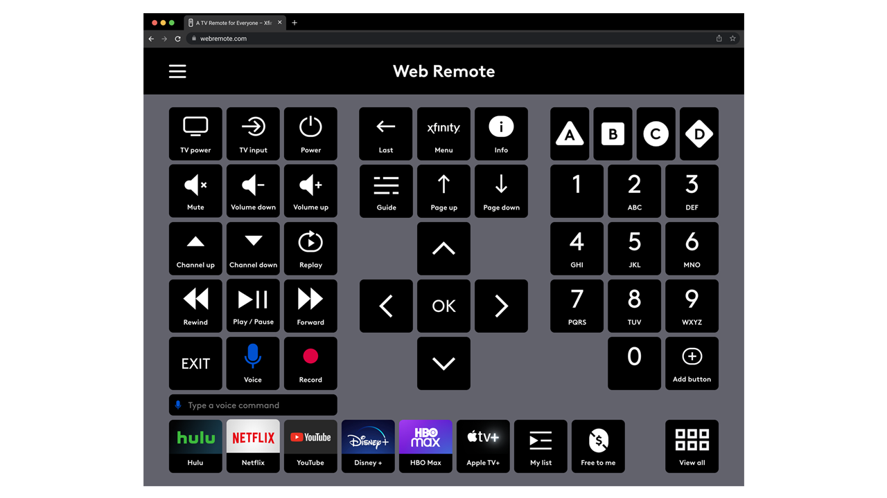
The Xfinity Web Remote (previously known as the Adaptive Remote) is a web-based application designed to simulate a handheld remote, specifically for members of the disability community who are unable to physically interact with a hand-held remote and often rely on assistive technology such as eye-tracking to interact with technology.
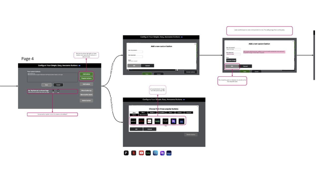
The Web Remote provides users with physical disabilities the opportunity to independently interact with their television without the need of an assistant. Custom Buttons allow users to create their own shortcuts to the content they enjoy most, a way to bookmark favorite apps, programs and channels. The initial implementation of this capability was not discoverable and complicated by involving overlays and hidden functionality.
The goal of this project was to reduce clicks by elevating controls, eliminate overlays and design buttons that would fit within the existing grid to optimize customization.
Client: Comast / Xfinty
Project date: 2022
Role: UX Lead
Team members: Liana Bishop, UI | Gary Rancier, Developement
Scope: One day this remote will be fully customizable and allow users to configure a remote to meet their specific needs; due to a short timeline and limited resources improving the existing custom button experience is a good start.
Process
Research
Used and tested the adaptive remote in its current form, including doing an evaluation of the Beta version of Custom Buttons
Experimented with various pieces of assistive technology including switch controls and eye tracking devices with tablets
Worked with research team who had conducted usability testing with members of the ALS community
Learnings
Reduce clicks: every click takes time—especially for users who rely on eye-tracking as their only way to interact with the web—use a few clicks as possible to move through the experience
Discoverability: take this important functionality and put it in front of users and not hidden in a menu
Remove less accessible design patterns such as scrolling and overlays; keep everything on the full screen and utilize simple and intuitive methods of interaction
Implementation
Design Updates
Provided guidance on a new design for the overall button style as to fit within the existing grid
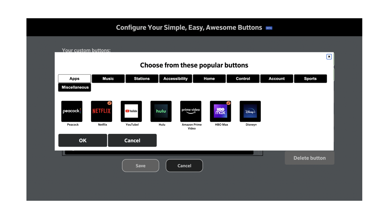
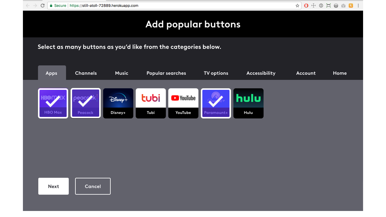
Worked with our designer to redesign the overall look of the popular button tabs to be able to fit more buttons and remove the need for scrolling
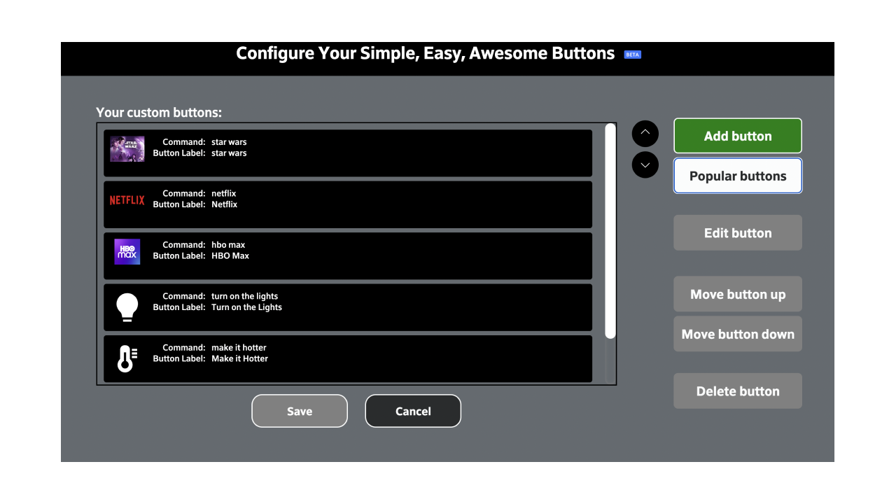
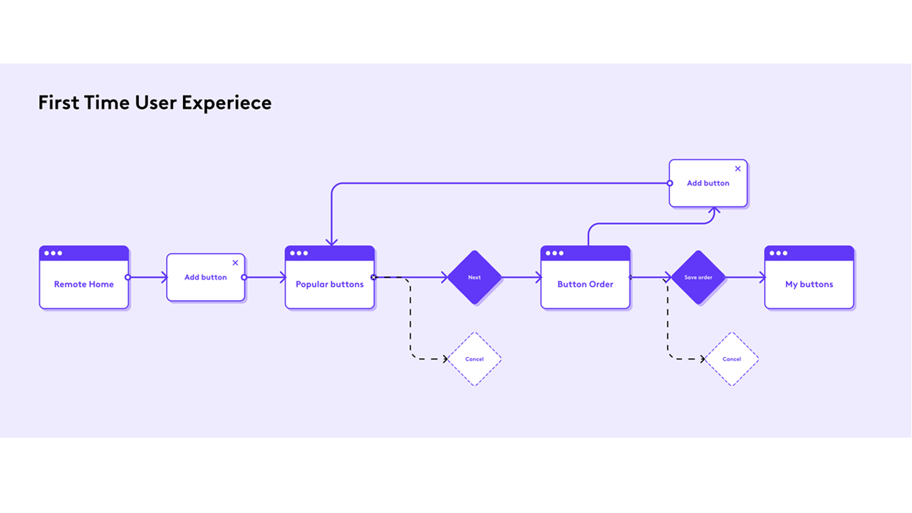
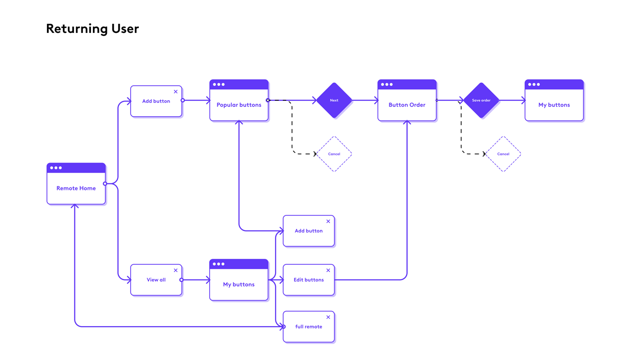
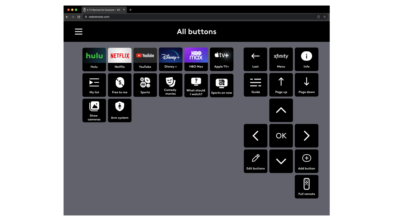
Addition of new buttons on the main and secondary screen to easily add and edit buttons
Improvements
Discoverability
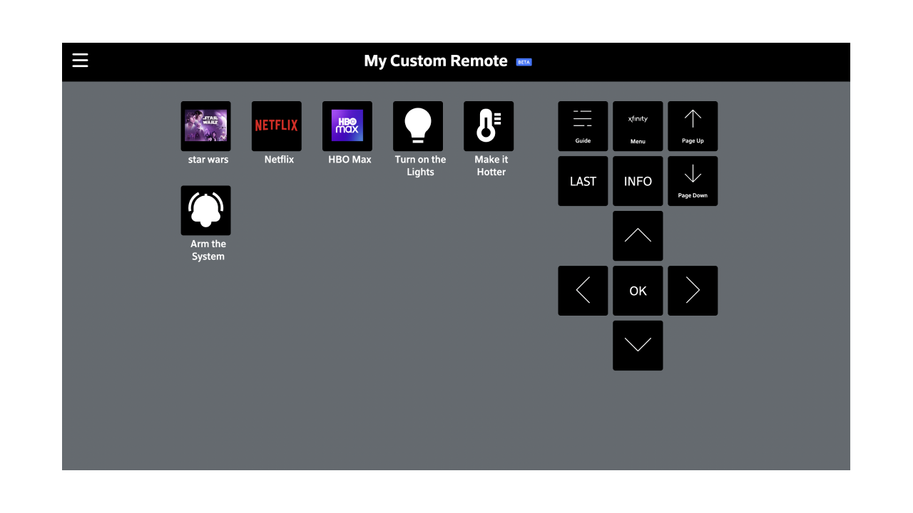
Placed the ability to add new buttons on the home and secondary screens so users can quickly add them as needed
Added favorite custom buttons to the main remote screen to reduce the need to go back and forth
Accessible design
Eliminated overlays and unnecessary scrolling
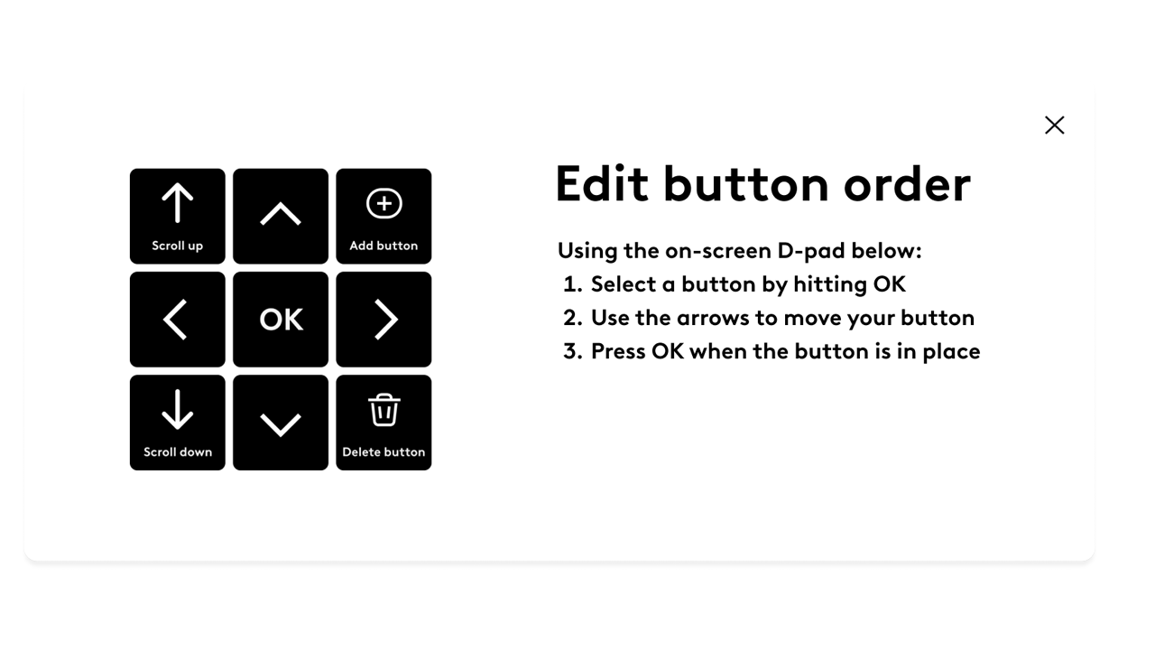
Included an on-screen D-pad to make button order customization easy and intuitive (future iterations will allow for users to also click and drag or use keyboard arrows and buttons)
With the simple addition of a couple of buttons users can quickly flip between remote screens
Outcomes
This project is about to launch to the general audience where we hope to do continued research and discovery on the new design patterns and continue to improve as time and budget allow.
