Voice Search Pivots
Voice is one of the most popular features on Comcast platforms, and a proven mechanism for driving engagement and increasing retention with customers.
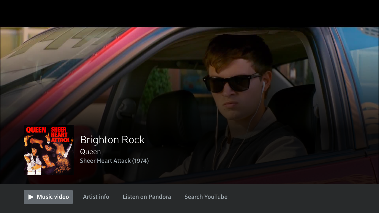
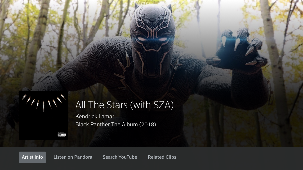
Overlayed voice responses—aka TV Cards—are full-width, lower third elements, that provide responses to specific voice triggers that are meant to give you brief, in-the-moment information without fully disrupting video playback. The initial launch of TV cards satisfied the initial need to provide users with snackable information, but did not provide users with a method to continue to engage or explore provided information at a deeper level.
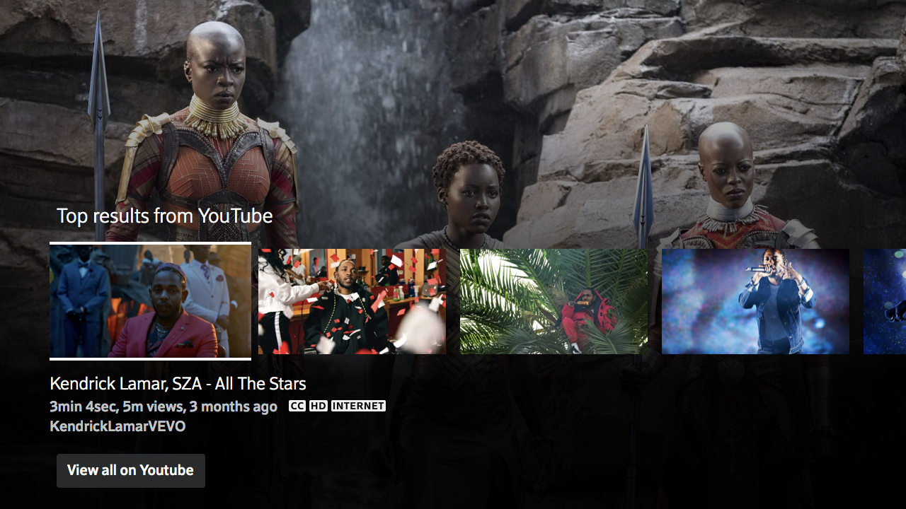
Voice Cards 2.0 were designed to provide voice users with the opportunity to gain additional information, or relevant interactions after the initial voice query through the inclusion of interactive elements called ‘pivots’.
Client: Comast, Xfinty
Project date: 2019
Role: UX Lead
Partners: Michael Lacek, UI | Amanda Olsovsky, ACD
Scope: This project was centered around four specific voice queries: song identification, current weather, daily horoscope and stock listings. The greatest limitation on this design was a lack of system context, and for music specifically a lack of integrated partners that could support some of the asks. (Viewed below will be a focus on What Song is This?)
Process
Starting with research I performed a competitive analysis of similar voice platforms, such as: Apple TV, Amazon Fire Cube and Chromecast to see how they handled a song-id skill. Learning that while some platforms did support such a command none of them were offering much of way to continue to interact with the presented information.
Next I began to ideate around what kind of pivots (interactive buttons found at the bottom of an overlay) would users most likely interact with in the TV space. I had previously done some detailed work around music providers and typical actions available within playback and app UIs which offered background knowledge and inspiration for pivot ideas, such as saving to a playlist, or opening in an app.
Learnings
Create a way for users to save a song for later (on X1 or via a music streaming app)
Allow users to watch the music video on X1
Learn more about the artist
Search for content on a video streaming partner app
Launch a station on a music streaming partner app
The last part of my exploration was to compare my list of dream pivots above with our development team to learn what would be truly feasible at this phase. Learning what we would be able to support as an action, in addition to how those actions may or may not impact the user experience.
Phase One:
Learn more about the artist
Search for content on a video streaming partner app
Launch a station on a music streaming partner app
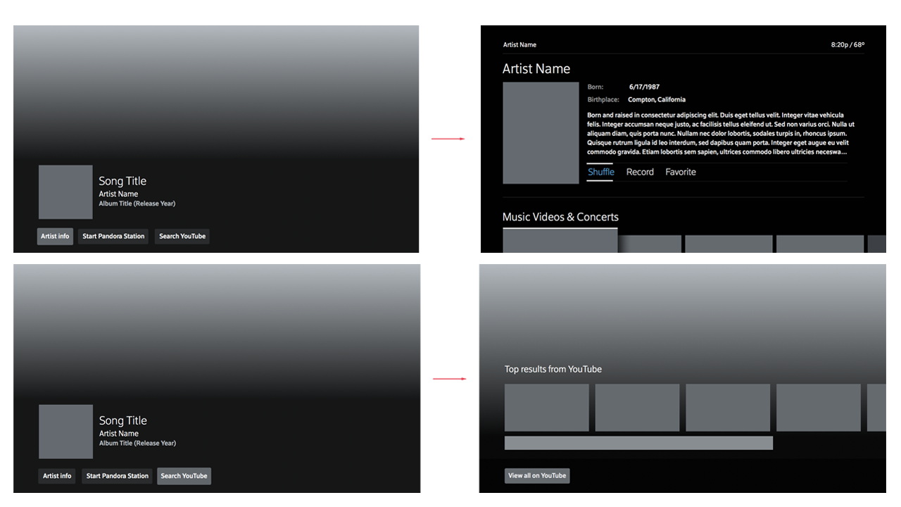
For phase one we chose to focus on the top three items that we knew we could achieve with the most accuracy. If we can identify the song in our system we can direct users to the artist page on our platform or easily send the data to one or more partners such as Pandora or YouTube who also have rich catalogs to work with.
Implementation
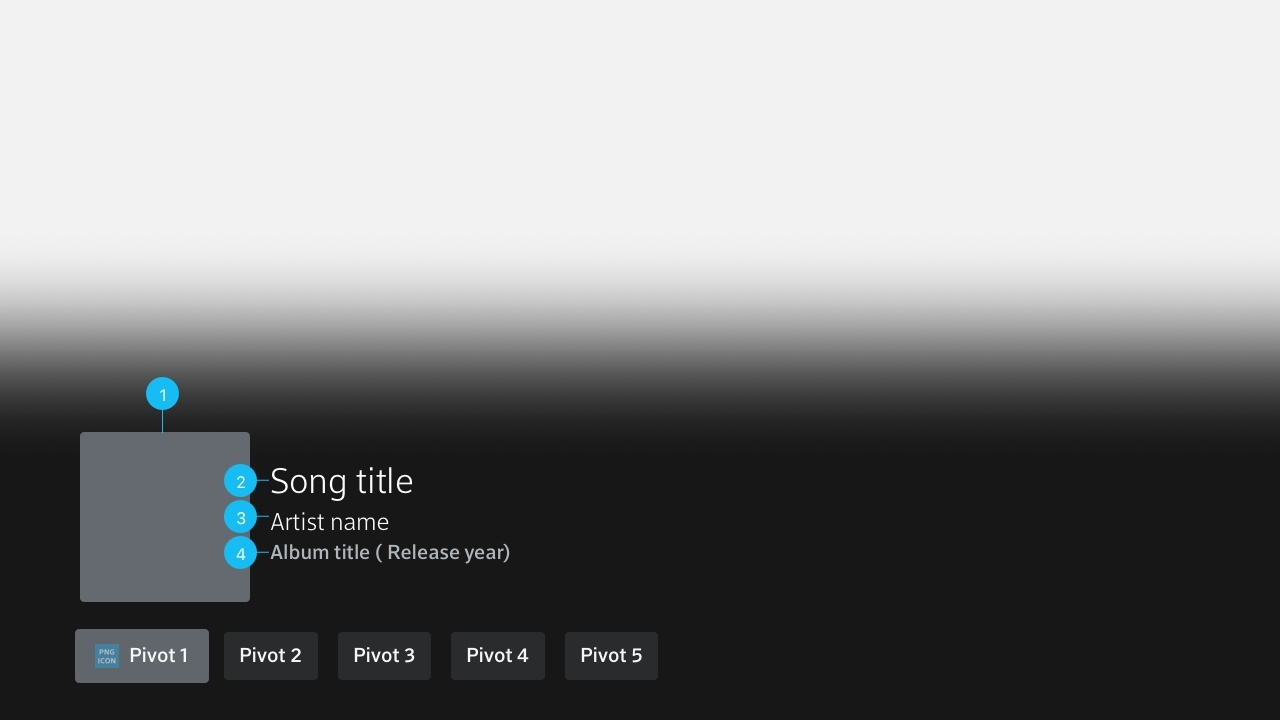
Working with the designer I provided guidance on overall design of buttons, location, and states such as focus vs not in focus; as well as direction on important metadata, imagery and other important elements required for the optimal experience.
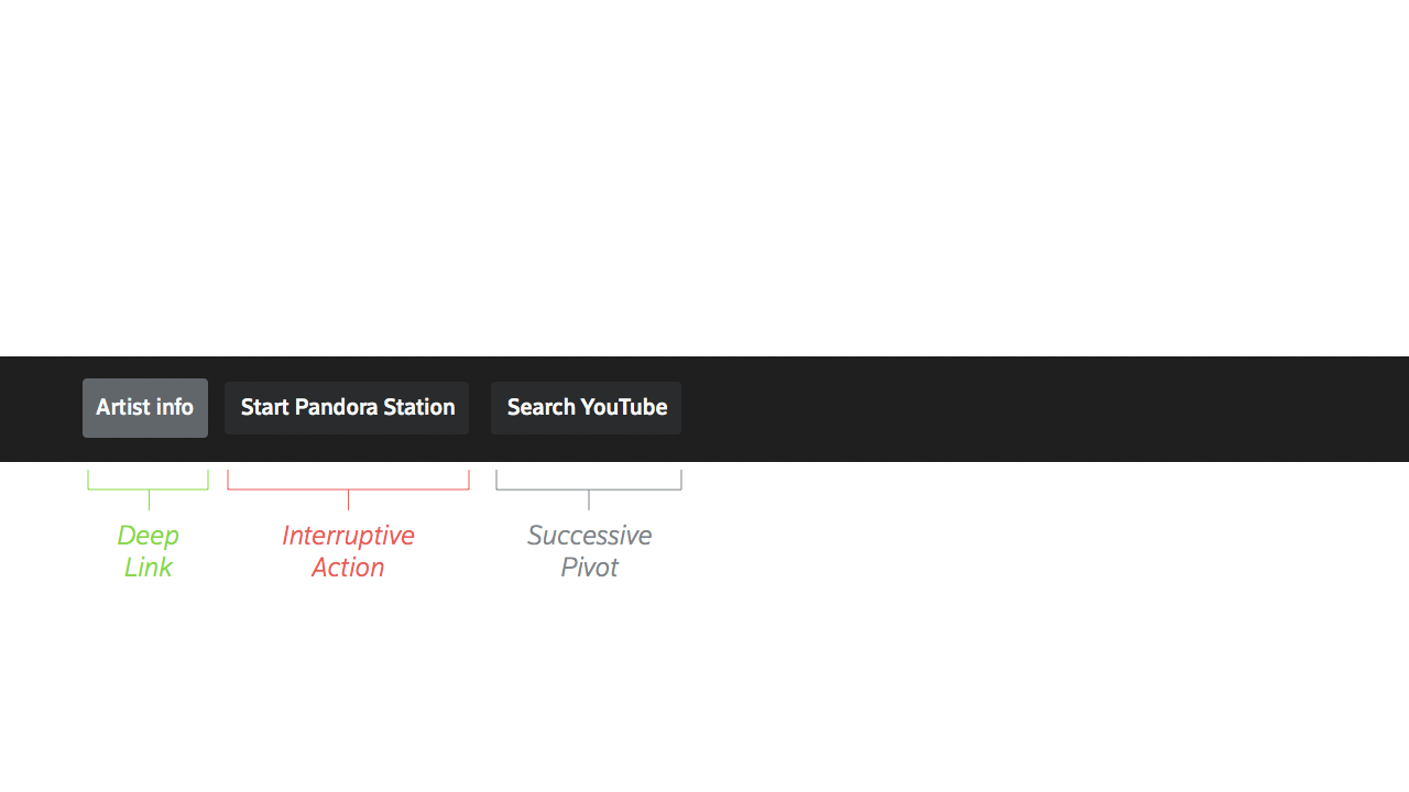
I also provided clear and concise definitions for each kind of pivots so fellow designers and product partners would understand the usage and reasoning behind the kind of pivots available for an experience.
Pivots:
Deep link: closes the overlay and directs user to a location within the X1 platform while original content plays in the background
Interruptive action: closes the overlay and launches an entirely new experience, removing the user from the original content
Successive pivot: overlay remains open and user is directed to a secondary lower-third card with interactive tiles; original content remains playing on the full screen; user can navigate between cards
Outcomes
The inclusion of pivots on TV cards enhanced the overall experience for users by providing a method to further interact with on-screen content. The principles and guidelines I created around pivots, such as pivot behaviors, number of pivots and maximum number of subsequent pages allowed designers across teams to create their own interactive lower thirds that aligned with the overall design and strategy.
